
DELHI METRO APP
(A STUDY AND A DESIGN)
The Delhi Metro app on the Play Store even when it does actually have a bucket load of useful information about everything you need. It's just not very usable in it's current state, as for the alternatives we don't really have a good choice there either. (Yes, I tried a lot of them)

WHY?
Just a regular day travelling in Delhi metro. I was at an interchange station waiting for my friend to arrive.
That's where within 10 minutes almost 7-8 people asked me about their destination stations and how to get there and this wasn't the first time I was asked this.
Some routes I remembered, others I didn't. So I pulled out my phone and opened the Delhi Metro app, to my surprise none of the travelers knew about the app. At first I thought that maybe it's just lack of marketing but as it soon turned out, it was very difficult to use the application for basic stuff (the app had all the information, it just didn't know how to give it to you).
That's where I realized that I won't recommend this to people and that's probably why people didn't know about it. The best publicity is word of mouth and that's not gonna happen here.
The Analysis
It started by analyzing the current Delhi Metro app and some alternatives that are out there in the market.
While a few apps tried to make the experience better, they either lacked a good UI or some basic functionalities were confusing to use.
The Pain Points
-
"It's difficult to choose between routes"
-
"Interchange station information is not clear"
-
"The app looks outdated"
What do you use it for?
Based on 1 to 1 interviews we determined the app is mostly used for 3 things:
-
Travel route and interchange stations.
-
Cost of travel.
-
Travel duration.


WIRE-FRAMING

I LOVE TO START WITH A SIMPLE PENCIL AND PAPER SKETCH OF HOW I WOULD WANT THE APP TO LOOK LIKE AT A GLANCE.
THIS HELPS IN DECIDING ON SOME BASIC ELEMENTS AND THEIR PLACEMENTS ON THE SCREEN AND IS ALSO USEFUL FOR GETTING GOOD FEEDBACK AT INITIAL STAGES OF DESIGN.
LANDING PAGE WIRE-FRAME

Typography
Montserrat (Bold)
Montserrat was used for the headings
However, Lato was used for all the text content ranging form labels to button texts to descriptions. Keeping it simple and contrasty from the heading was the point.
Lato (Regular)


ESSENTIALS
(on fingertips)
ALL THE BASIC AND FREQUENTLY USED OPERATIONS OF THE APP MOSTLY HAVE TO DO WITH YOUR JOURNEY FROM A STARTING POINT TO A DESTINATION.
THIS NEW AND IMPROVED DESIGN FOCUSES EXACTLY ON THAT AND GIVES USER THE OPTION TO STRAIGHT AWAY FIND ROUTES AND OTHER NECESSARY INFO ABOUT THE JOURNEY RIGHT FROM THE LANDING SCREEN ITSELF.

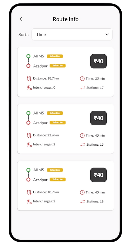
OPTIONS
(lots of them)
WHEN CHOOSING BETWEEN ROUTES YOU HAVE ACCESS TO ALL THE BASIC INFORMATION ABOUT EACH ROUTE ON SCREEN TO HELP YOU DECIDE WHICH ROUTE TO PICK.
THE USER CAN SORT THROUGH DIFFERENT OPTIONS BASED ON THIER NEEDS AND PREFERENCES.

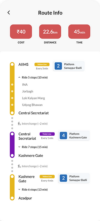
INFORMATIVE
(but organized)
THE APP GIVES YOU ALL THE DETAILED INFORMATION ABOUT YOUR JOURNEY ON THE RIGHT SCREEN.
WE ALLOW ROOM FOR SOME WHITE SPACE IN ORDER TO NOT MAKE IT EASY TO CONSUME WHILE GIVING EVERY DETAIL TO THE USER IN AN ORGANIZED FASHION.
-
THE BASIC INFORMATION IS AT THE TOP.
-
THE LINES ARE COLORED BASED ON METRO LINES.
-
PLATFORM DETAILS RESEMBLE THE ACTUAL METRO PLATFORM SINAGE.
-
DETAILED STOP INFORMATION CAN BE EXPANDED ON NEED.


